How to Prompt LLMs to Generate Clean Tailwind CSS Components
Stop getting class soup. Learn the prompt structure that makes ChatGPT and Claude write clean, token-based Tailwind CSS components you can ship.

PromptsBuddy
Editorial
Generating a Tailwind CSS component with an LLM takes seconds. But making that component clean, responsive, and consistent with your existing codebase often takes much longer.
You ask ChatGPT or Claude to create a pricing card or dashboard layout. The result looks good at first, but a closer look reveals hardcoded colors, arbitrary spacing values, outdated Tailwind utilities, and repeated class names.
These issues become harder to manage as you add more components. Buttons start looking different, layouts become inconsistent, and small design changes require edits across multiple files.
The problem is often not the generated code itself, but the instructions given to the model.
Without knowing your Tailwind version, design tokens, component structure, and coding standards, an LLM fills in the missing details with its own assumptions.
This blog explains how to prompt LLMs to generate clean Tailwind CSS components using Tailwind CSS v4. You'll find a reusable prompt template, practical before-and-after examples, common mistakes to avoid, and a simple method to evaluate the generated code.
The goal is to produce components that work well beyond the initial preview and remain consistent as your project grows.
Why LLMs Struggle to Generate Clean Tailwind CSS Code
LLMs can generate visually appealing Tailwind CSS components, but the code often lacks consistency, maintainability, and proper structure. A component might look correct in the browser while containing outdated utilities, hardcoded values, or missing interaction states.
This usually happens because the model doesn't have enough information about your project's requirements. Four common issues explain why.
1. Outdated Tailwind CSS Patterns
Tailwind CSS v4 introduced CSS-first configuration and updated several utility classes. Without clear version instructions, an LLM may generate older v3 patterns, such as @tailwind base or bg-opacity-50. Some outdated utilities fail silently, making these problems difficult to spot during development.
2. Missing Design Tokens
When you don't provide your project's color palette, spacing rules, or design tokens, the model makes its own choices. It might use bg-blue-600, hardcoded hex colors, or arbitrary spacing values instead of your existing design system. This creates inconsistencies across components.
3. Unclear Component Requirements
A request like "create a responsive card" leaves too many details open. The generated component may look acceptable but lack hover effects, keyboard focus indicators, disabled states, or semantic HTML. For example, the model might use a clickable div instead of a proper button.
4. Repeated Classes and Poor Reusability
LLMs often generate components independently without considering existing patterns in your codebase. As a result, the same long Tailwind class strings appear across multiple files, making future styling changes harder to maintain.
The solution is to give the model specific instructions instead of simply asking for clean code. Define the Tailwind version, provide your design tokens, specify component behavior, and establish rules for reusable code. These details help the model generate more consistent components from the first prompt.
Outdated Tailwind CSS Patterns That Cause Silent Errors
Tailwind CSS v3 patterns can create problems when an LLM generates code for a v4 project. Some outdated utilities fail without showing errors, while others still compile but produce unexpected results.
The following examples show common version-related issues observed during testing:
Outdated CSS directives:
@tailwind base; @tailwind components; @tailwind utilities;compiled without errors but generated only a 66-byte license comment instead of usable utilities. Tailwind v4 uses@import "tailwindcss";.Unsupported initialization command:
npx tailwindcss initreturns an "Invalid command: init" error. Tailwind v4 uses CSS-first configuration and no longer provides this initialization command.Removed opacity utilities:
bg-black bg-opacity-50no longer produces the expected transparency becausebg-opacity-50generates no CSS. Usebg-black/50instead.Changed ring defaults: The
ringutility now creates a 1px ring instead of the previous 3px default. Usering-3when a 3px ring is required.Deprecated utility names:
flex-shrink-0andbg-gradient-to-rstill compile as compatibility aliases, but the current utilities areshrink-0andbg-linear-to-r.
The main issue is that outdated code can appear correct even when it behaves differently than expected.
Specifying Tailwind CSS v4 and its current conventions directly in your prompt helps prevent these mistakes before they reach code review.
The five parts of a prompt that produces clean Tailwind
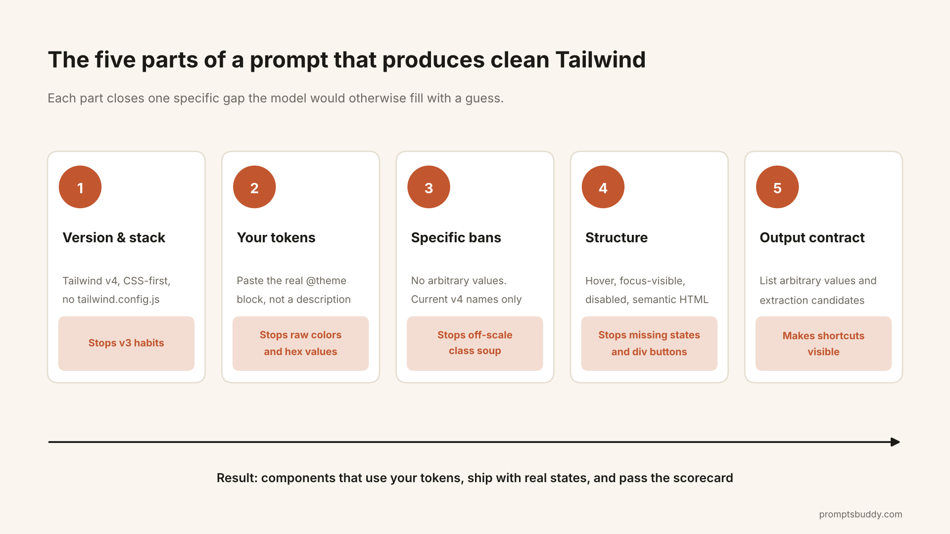
1. State the version and the stack
Say it plainly:
React 19, TypeScript, Tailwind CSS v4 (CSS-first config, no
tailwind.config.js).
In v4, setup is @import "tailwindcss"; in your stylesheet, and content detection is automatic, so there’s no content array. If the model hands you @tailwind base; or an init command, it has fallen back to v3. One correction usually fixes the rest of the session.
2. Paste your tokens, not a description of them
“Use our brand colors” means nothing to a model. Your actual @theme block does:
css
@import "tailwindcss";

@theme {
  --color-primary: #2563eb;
  --color-surface: #f8fafc;
  --color-ink: #0f172a;
  --color-muted: #64748b;
  --color-border: #e2e8f0;
  --color-danger: #dc2626;
  --radius-card: 0.75rem;
}
Each variable becomes utilities automatically: bg-primary, text-muted, border-border, rounded-card. Opacity modifiers work on them too, so hover:bg-primary/90 and ring-primary/20 compile as expected. Once the model sees the block, it writes against names you own.
3. Ban specific behaviours, not vague qualities
“Write clean code” does nothing. “No arbitrary values; if one is unavoidable, explain why in a comment” can be checked. Specific, enforceable bans hold up better than tone instructions, which is the idea behind the standing-instruction approach in Kill the flattery. The same logic applies to code.
The bans worth including:
No arbitrary values (
mt-[13px],text-[#333])No raw palette colors or hex codes, only your tokens
No
@tailwinddirectives, notailwind.config.js, nobg-opacity-*Current v4 names only (
shrink-0,grow,bg-linear-to-*)
4. Specify structure: states, semantics, breakpoints
List what must exist: hover, focus-visible, disabled, the right HTML elements, and what happens at each breakpoint. “Make it responsive” gets you a guess. “One column on mobile, two at md, four at lg” gets you a layout.
5. Define the output contract
Tell the model what to return and what to flag. Asking it to list every arbitrary value it used and every pattern worth extracting turns hidden problems into a visible checklist.
A copy-ready master prompt
You are writing a React component styled with Tailwind CSS v4.

STACK: React 19, TypeScript, Tailwind CSS v4 (CSS-first config, no
tailwind.config.js). Use the cn() helper from "@/lib/cn" for conditional classes.

DESIGN TOKENS (defined in @theme, use only these names for color and radius):
{{TOKENS}}

COMPONENT: {{WHAT_YOU_NEED}}
LAYOUT BY BREAKPOINT: {{LAYOUT}}

RULES
- Use only the default spacing, type and size scale. No arbitrary values
  (w-[437px]). If one is truly unavoidable, use it and say why in a comment.
- Colors and radii come from the tokens above. No raw palette colors
  (blue-600), no hex values.
- Mobile-first: base classes for mobile, sm:/md:/lg: layered on top.
- Semantic HTML: button for actions, a for navigation, article/section/nav
  where they fit.
- Include hover, focus-visible and disabled states.
- No dark: variants. Dark mode is handled by swapping the tokens.
- Variants (size, intent) go through props and cn(), not duplicated markup.
- If a class string repeats, or one element passes ~15 utilities, split it
  into a sub-component.
- Tailwind v4 only: no @tailwind directives, no bg-opacity-*, and current
  names (shrink-0, grow, bg-linear-to-*, bg-black/50).

OUTPUT
1. The component in one code block, nothing else inside it.
2. "Arbitrary values used:" a list, or "none".
3. "Extraction candidates:" repeated patterns worth turning into components.
At about 220 words it’s short enough that the model follows all of it. Longer rule lists tend to get partly ignored, especially deep into a chat. The “~15 utilities” threshold is a rule of thumb, so adjust it to your codebase.
The prompt assumes a cn() helper. If you don’t have one, it’s three lines using two small packages, clsx and tailwind-merge:
ts
// lib/cn.ts
import { clsx, type ClassValue } from "clsx";
import { twMerge } from "tailwind-merge";

export const cn = (...inputs: ClassValue[]) => twMerge(clsx(inputs));
clsx handles conditional classes, and twMerge resolves conflicts, so a className passed in from outside overrides the component’s defaults instead of fighting them.
Before and after: a pricing card
Here is a typical unconstrained first pass. It’s a representative sample of patterns that recur in unconstrained output, not one model’s verbatim response:
jsx
<div className="w-[437px] bg-white p-[22px] rounded-[14px] shadow-[0_4px_12px_rgba(0,0,0,0.08)] border border-[#e5e7eb]">
  <h3 className="text-[19px] font-bold text-[#111827]">Pro</h3>
  <button className="mt-[18px] bg-blue-600 hover:bg-blue-700 text-white px-[18px] py-[10px] rounded-[8px] text-[15px]">
    Choose plan
  </button>
</div>
And the shape of output the master prompt steers toward. I compiled this one against the @theme block above, and every utility generated a rule:
jsx
import { cn } from "@/lib/cn";

export function PricingCard({ name, price, features, featured = false, className }) {
  return (
    <article
      className={cn(
        "flex w-full max-w-sm flex-col gap-6 rounded-card border border-border bg-surface p-6 shadow-sm",
        featured && "border-primary ring-2 ring-primary/20",
        className
      )}
    >
      <h3 className="text-lg font-semibold text-ink">{name}</h3>
      <p className="text-4xl font-bold text-ink">
        {price}
        <span className="text-base font-normal text-muted">/mo</span>
      </p>
      <ul className="flex flex-col gap-2 text-sm text-muted">
        {features.map((f) => (
          <li key={f}>{f}</li>
        ))}
      </ul>
      <button
        type="button"
        className="mt-auto rounded-lg bg-primary px-4 py-2.5 text-sm font-medium text-white hover:bg-primary/90 focus-visible:outline-2 focus-visible:outline-offset-2 focus-visible:outline-primary disabled:opacity-50"
      >
        Choose {name}
      </button>
    </article>
  );
}
The fixed width is gone (w-full max-w-sm), the colors come from your tokens, and the button has real states. The featured variant is a prop, so you don’t copy the markup into a second component.
Score the output instead of eyeballing it
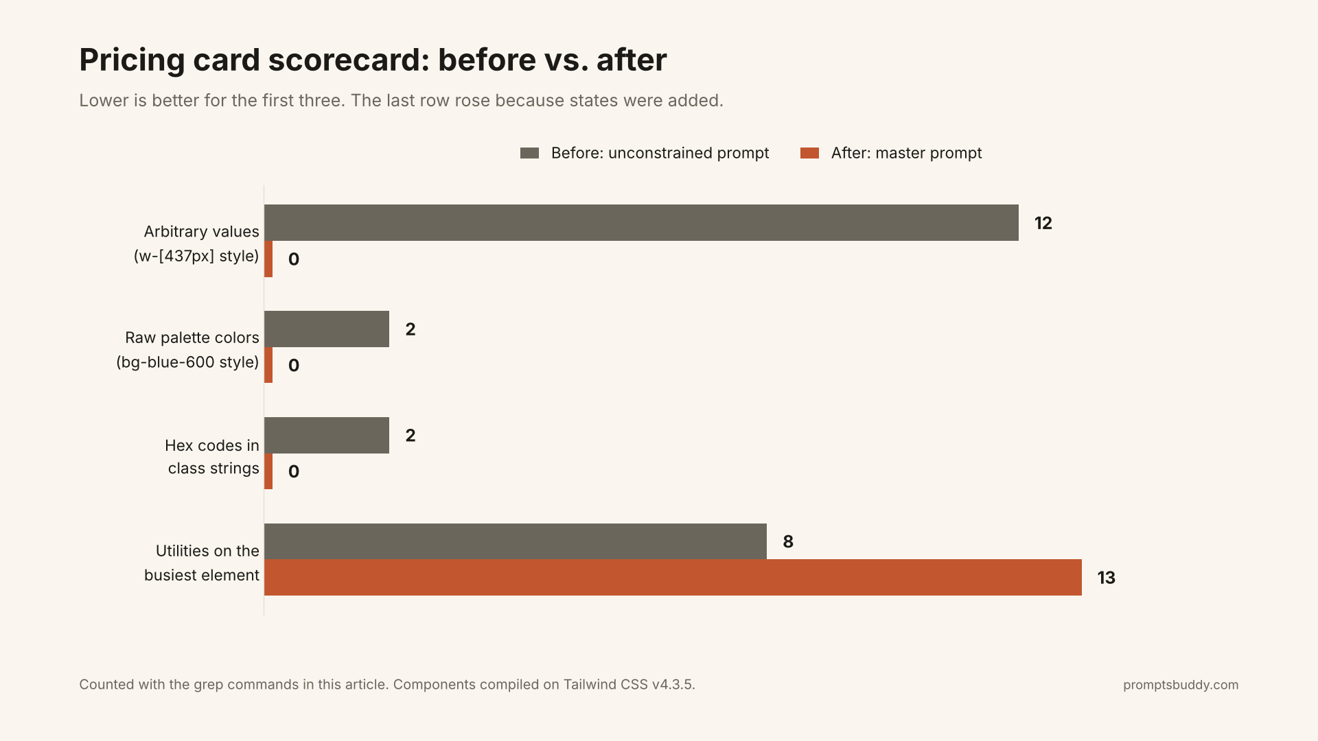
“Looks clean” is how drift starts. These are the numbers for the two components above, counted with the commands below:
Metric | Before | After |
|---|---|---|
Arbitrary values ( | 12 | 0 |
Raw palette colors ( | 2 | 0 |
Hex codes inside class strings | 2 | 0 |
Utilities on the busiest element | 8 | 13 |
The last row went up, and that’s fine. The button gained hover, focus-visible and disabled states, which cost utilities. The hex codes are also counted inside the arbitrary-value row, so don’t add the rows together. The goal isn’t fewer classes. It’s zero off-system values, and a ceiling (about 15) that tells you when to extract a component.
To count your own:
bash
# Arbitrary values, e.g. w-[437px], mt-[13px]
grep -ohE '\b[a-z-]+-\[[^]]+\]' src --include=*.tsx | wc -l

# Raw palette colors, e.g. bg-blue-600, text-slate-500
grep -ohE '\b(bg|text|border|ring|outline)-(red|orange|amber|yellow|lime|green|emerald|teal|cyan|sky|blue|indigo|violet|purple|fuchsia|pink|rose|slate|gray|zinc|neutral|stone)-[0-9]{2,3}' src --include=*.tsx | wc -l
Both will also flag legitimate uses, such as grid-cols-[1fr_auto] or bg-[url(/hero.png)]. Treat the output as a list to review, not a failing build. What you want is a number you can compare each time you change the prompt.
Prompt the loop, not the one-shot
Even a good prompt gives you a first draft. The cleanest results come from four short passes:
Let it ask first. For anything non-trivial, have the model interview you before it writes markup. The Make it ask before it answers prompt does this in four lines, and it usually surfaces the missing detail (an icon library? an existing button component?) before it becomes a rewrite.
Generate with the master prompt. Read the “arbitrary values used” and “extraction candidates” lists before the code.
Audit. Paste the component back and ask for a review against your tokens. A structured pass, like the design, correctness and craft split in A code review that teaches, works better than “any improvements?” because every note has to carry its reasoning.
Extract. If a pattern appears in two places, ask for it as a component. In React, a component usually beats
@apply, because the component is the unit of reuse.
A short token-audit prompt for existing code:
Here are my tokens: {{THEME_BLOCK}}
Review the component below. List every class that uses a color, radius or
spacing value outside these tokens or the default scale. For each, give the
closest token and the one-line change. Do not rewrite the component.
Run it over a folder of components once a month and drift shows up before a reviewer has to spot gap-[15px] among fifty classes.
Dark mode: swap tokens, don’t scatter dark:
The master prompt bans dark: variants on purpose. A model asked for dark mode will add dark:bg-slate-900 dark:text-slate-100 to every element, and you’ll maintain that forever. Semantic tokens remove the need.
Tailwind v4 utilities compile to variable references. I checked, and bg-surface compiles to background-color: var(--color-surface). So you override the variable once:
css
@media (prefers-color-scheme: dark) {
  :root {
    --color-surface: #0b1220;
    --color-ink: #e2e8f0;
  }
}
Every component built on bg-surface and text-ink switches with no markup changes. If you use a class-based toggle instead of the system preference, the same idea applies, with the override scoped to your dark class.
Let tooling catch what prompts miss
Prompts get you most of the way, and tooling enforces the rest. Two cheap backstops:
Class sorting. The official Prettier plugin for Tailwind sorts classes into a consistent order, so long strings become easier to scan and diff.
Variants through props. Once a component has size or intent options, a helper such as
class-variance-authoritykeeps them structured instead of growing into nested ternaries. You can ask the model to use it in the same prompt.
Make the rules stick across sessions
Re-pasting a rule list every time guarantees you’ll skip it on a busy day. Put the stack, the token block and the bans in your project instructions or system prompt, and keep only the component request in the chat.
Long chats also dilute rules. Instructions at the top of a 60-message thread get less attention than the latest message. That’s a core idea in context engineering, and the practical answer is to restate the rules or start a fresh chat per component.
If you work with an agent setup, you can also package the whole rule set as a reusable skill so it loads the same way every time.
Common failures and the one-line fix
Symptom | What actually happens (tested) | Fix to add |
|---|---|---|
| Compiles silently to a file with no utilities | “Tailwind v4: |
|
| “CSS-first config, |
|
| “Use |
| Plain | “Use |
| Still compile as deprecated aliases | “Current names: |
| Works, but bypasses your theme | Paste the |
| Works, but off the scale | “No arbitrary values; justify any exception” |
| Renders, but not keyboard-accessible | “Semantic HTML: button for actions” |
Same 25 classes in five files | Works until the design changes | “Split repeated or 15+ utility strings into a component” |
When a Detailed Tailwind Prompt Isn't Necessary
A detailed prompt isn't always required to generate Tailwind CSS components. For quick prototypes, experimental layouts, or one-page demos, a simple instruction may be enough to produce a working result.
However, the requirements change when you're building components for a production application. Consistent styling, reusable code, responsive layouts, and adherence to your design system become more important as the project grows.
The key is to match your prompting approach to the complexity and long-term use of the component. Use shorter prompts for quick experiments and structured instructions for components that need to remain consistent, maintainable, and reusable across your codebase.
Conclusion
Clean Tailwind from an LLM isn’t a model problem. It’s a specification problem. The model writes whatever your prompt leaves open, and what it leaves open is usually your version, your tokens and your standards.
The costly part is that the failures are quiet. A v3 directive compiles to nothing, a removed opacity class turns your overlay solid, and a raw blue-600 works fine until your brand color changes. You won’t catch these by looking at a preview. You catch them by putting the rules in the prompt and counting the output.
So close the gaps. Name the version, paste your @theme block, ban specific behaviours, require real states and semantic HTML, and make the model report its own shortcuts. Handle dark mode by swapping tokens. Then run the scorecard and keep the numbers.
Start small. Drop your tokens into the master prompt, build one component, and count its arbitrary values. Tighten the prompt until that count stays at zero. When it does, save it in the PromptsBuddy prompt library or contribute it so others can run it too.